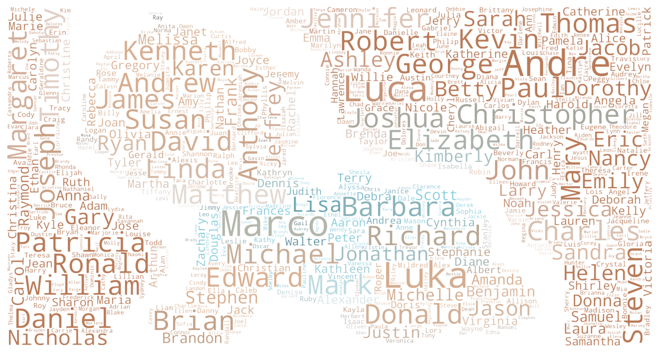
Analyzing Birth & Naming Trends: A Data-Driven Exploration
Note: For a detailed view of the code for data preprocessing, transformation and visualizations, you can visit the GitHub repository
Introduction
In a world filled with unique and diverse names, have you ever wondered how the popularity of names changed over the years? or how the flactuations in birth rate affected the naming patterns? Thanks to the Social Security Administration (SSA), we can dive into a treasure trove of data that provides fascinating insights into baby names. This allows data enthusiasts to analyze the the naming trends across different regions of the United States. This project aims to examine this data, uncovering intriguing patterns and trends in birth trends and naming practices in the U.S.
The analysis conducted in this study relies on the Python programming language for data manipulation and visualization tasks. The following libraries were utilized throughout the project:
1
2
3
4
5
6
7
8
9
10
11
12
13
14
15
16
17
18
19
20
# for data manipulation
import pandas as pd
import numpy as np

# for visualizations
import matplotlib.pyplot as plt
import seaborn as sns
import matplotlib.ticker as ticker
from matplotlib import lines, patches
import matplotlib.patheffects as path_effects


# for title image
from wordcloud import WordCloud, ImageColorGenerator
from PIL import Image

# miscellaneous
import zipfile
import requests
import os
The primary objective of this project is to demonstrate the remarkable potential of Python in achieving highly effective
static visualizations.
Understanding the Data
The SSA, the government agency responsible for administering social security programs, has been collecting and maintaining data related to baby names for over a century. With over 6 million entries This comprehensive but relatively simple dataset covers a wide range of information, including the state, gender, year, name, and number of births associated with each name. To give you a taste of this valuable resource, let’s take a closer look at the format of the data. Each entry in the dataset represents a unique baby name registered with the SSA by year and state, and includes the following details:
| State | Gender | Year | Name | Births |
|---|---|---|---|---|
State: The specific state within the United States where the baby was born and the name was registered.
Gender: The gender of the baby associated with the name, denoted by ‘F’ for female or ‘M’ for male.
Year: The year in which the baby was born and registered, providing a temporal context for the frequency of the name.
Name: The actual name that was given and registered.
Births: The number of registered births associated with a particular name, indicating its frequendy within a given state and year.
Importing & Transforming the Data
The source data obtained from the SSA website consists of a collection of TXT files, each corresponding to a specific state. These files are compressed within a ZIP archive. Python can be employed to download, extract, transform and aggregate this data, enabling its utilization for analysis purposes.
1
2
url = "https://www.ssa.gov/oact/babynames/state/namesbystate.zip"
df = download_data(url)
Click here to have a closer look into the code for download_data function
def get_transform_data(url):

    # Create the path folder if not already there
    folder_path = 'Data'
    if not os.path.exists(folder_path):
    os.makedirs(folder_path)

    # Path to download the file to
    file_path = 'Data/dataset.zip'
    df = None

    # Define a mapping from abberivated to full state names
    state_dict = {
        'AL': 'Alabama','AK': 'Alaska','AZ': 'Arizona','AR': 'Arkansas',
        'CA': 'California','CO': 'Colorado','CT': 'Connecticut','DE': 'Delaware',
        'FL': 'Florida','GA': 'Georgia','HI': 'Hawaii','ID': 'Idaho',
        'IL': 'Illinois','IN': 'Indiana','IA': 'Iowa','KS': 'Kansas',
        'KY': 'Kentucky','LA': 'Louisiana','ME': 'Maine','MD': 'Maryland',
        'MA': 'Massachusetts','MI': 'Michigan','MN': 'Minnesota','MS': 'Mississippi',
        'MO': 'Missouri','MT': 'Montana','NE': 'Nebraska','NV': 'Nevada',
        'NH': 'New Hampshire','NJ': 'New Jersey','NM': 'New Mexico','NY': 'New York',
        'NC': 'North Carolina','ND': 'North Dakota','OH': 'Ohio','OK': 'Oklahoma',
        'OR': 'Oregon','PA': 'Pennsylvania','RI': 'Rhode Island','SC': 'South Carolina',
        'SD': 'South Dakota','TN': 'Tennessee','TX': 'Texas','UT': 'Utah',
        'VT': 'Vermont','VA': 'Virginia','WA': 'Washington','WV': 'West Virginia',
        'WI': 'Wisconsin','WY': 'Wyoming', "DC": "Columbia"
    }

    # Send a GET request to the URL
    response = requests.get(url)

    # Check if the request was successful
    if response.status_code == 200:
        # Save the content of the response to a file
        with open(file_path, "wb") as file:
            file.write(response.content)
            print("File downloaded successfully.")

        # Aggregate and transform the txt files inside downloaded zip into one dataset
        with zipfile.ZipFile(file_path) as zf:
              df =  (pd.concat(
                          [pd.read_csv(zf.open(f),
                                        header=None,
                                        names=['State', 'Gender', 'Year', 'Name', 'Births'])
                            for f in zf.namelist() if f.endswith("TXT")],
                      ignore_index=True)
                        .assign(Year = lambda _df : pd.to_datetime(_df.Year,format="%Y")
                                +pd.offsets.YearEnd(0),
                              State = lambda _df: _df.State.map(state_dict)))
    else:
        print(f"Failed to download file. Status code: {response.status_code}")

    return df
Inferential Analysis
When it comes to the baby names, there’s more than meets the eye. Beyond the surface of personal preferences and trends, inferential analysis offers a deeper understanding of the underlying dynamics. Namely, I will explore the distribution of baby names unraveling the prevalent behavior and trends that shape name selection.
Distribution of Names
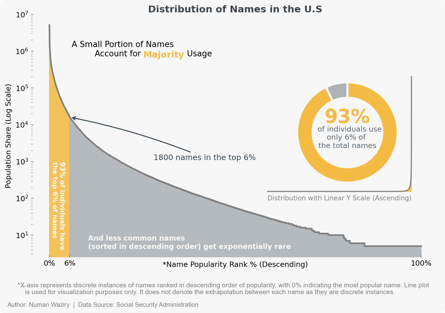 figure 1 An in initial look at the distribution pattern of names reveals a significant disparity, characterized by a notable imbalance between a small subset of frequently occurring names and a vast majority of infrequently observed names. This observation serves as a compelling basis for the hypothesis that names conform to a power law distribution.
Note: While interpreting a logarithmic scale plot may pose a challenge for those unaccustomed to it, using this scale is essential due to its ability to accommodate the significant skew present. A linear scale alone would result in a loss of vital visual information, making it an inefficient choice.
- To enhance understanding of the distribution, here’s an alternative visualization that conveys just about the same information while avoiding a logarithmic scale:
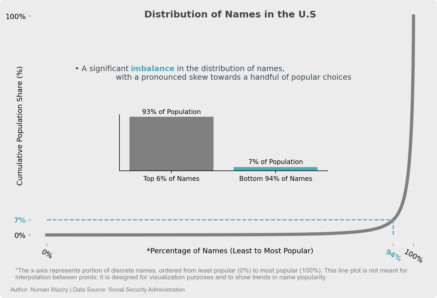 figure 2
Baby Names and the Power Law Distribution
Power-Law Probability Distribution: The power law distribution, also known as a Pareto distribution, follows the principle that the frequency or probability of an event is inversely proportional to its magnitude. In other words, larger events or values occur less frequently, while smaller events or values occur more frequently.
The power law distribution is an exponentially decaying function of the form $f(x) \sim x^{-\alpha}$, where $x$ is the variable and $\alpha$ is the scaling parameter.
Baby names and power law distribution are closely related. In the context of names, it means that a few names occur very frequently, while the majority of names occur infrequently.
This observed pattern is known as the Matthew effect, where the popular names become even more popular over time, while the less popular names continue to decline in popularity. This effect is driven by social influence and cultural trends, which can amplify the initial differences in popularity between names.
Given the primary focus of this project on visualizations, the goodness of fit will not be quantified, and instead, the fit between the data and the power law distribution will be visually represented using a log-log plot
To validate the power-law hypothesis, One method is to compare the probability densities between the theoretical power-law distribution and the empirical probability distribution of the data with a Q-Q Plot having logarithmic axes also referred to as log-log plot.
The theoretical probability density can be employed once we derive the $\alpha$ parameter for observed data - Fit the power-law distribution to data using maximum likelihood estimation to retrieve the scaling parameter $\alpha$ and utilize the probability density function.
\[\hat{\alpha} = 1 + n \left(\sum_{i=1}^{n} \ln\left(\frac{x_i}{x_{\text{min}}}\right)\right)^{-1}\]
The empirical probability densities of name can be retrieved by aggregating the births with respect to each name and then calculating the relative frequency of births that fall within small intervals or “bins” (of names sorted by occurrence/Birth) along the entirety of data.
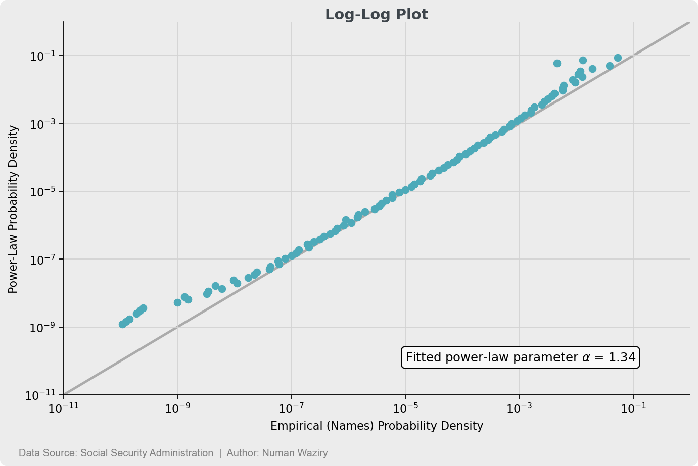 figure 3 Most of the data is clustered towards the 45° reference line, indicating a correlation between the names and power-law distribution
The section on inferential analysis explored advanced topics that may not appeal to the average reader. In the subsequent sections, the explanatory data analysis is divided into two parts: births and baby names.
To avoids unnecessary verbosity in the post, subsequent sections will start with a brief description to provide an understanding of the analysis being portrayed in the graph, followed by the graph itself
Exploratory Data Analysis
Births
In the initial segment of the Exploratory Data Analysis (EDA), the focus is on births. With the aid of informative visualizations and insightful analysis, we delve into various aspects including temporal variations, birth rates and noteworthy contributing states to overall birth.
Overall Birth Trend in US
The line plot provides a visual representation of the overall birth trend in the United States, utilizing a 5-year moving average. This smoothing technique allows for a clearer understanding of the long-term pattern by reducing the impact of short-term fluctuations. The graph showcases the general trajectory of birth rates over time, enabling readers to observe any notable changes or trends in the broader context of birth data in the country.
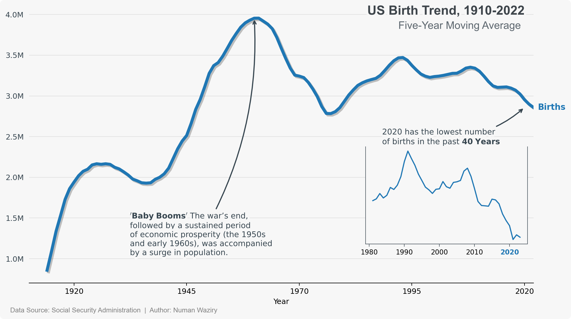 figure 4
Overall State Rankings by Birth
The heatmap displays the ranking of birth rates across states over time. Color intensity represents the rank value, with darker shades indicating higher ranks (high is worse). This visual provides a concise overview of relative birth rate rankings among states during the specified period.
![]() figure 5
figure 5
Top 6 Birth Rank Fluctuations
The graph showcases the birth rate (Births relative to total births) rankings of the top six states that have experienced significant fluctuations since 1910. By examining the changes in rank positions, valuable insights can be gleaned regarding the shifting patterns in these states’ birth rates.
![]() figure 6
figure 6
Top 10 States with Highest Births
The barplot displays the top 10 states with the highest number of births. Strikingly, the total births in these states surpass the combined births of all other states. This emphasizes the concentrated contribution of these states to the overall national birth statistics.
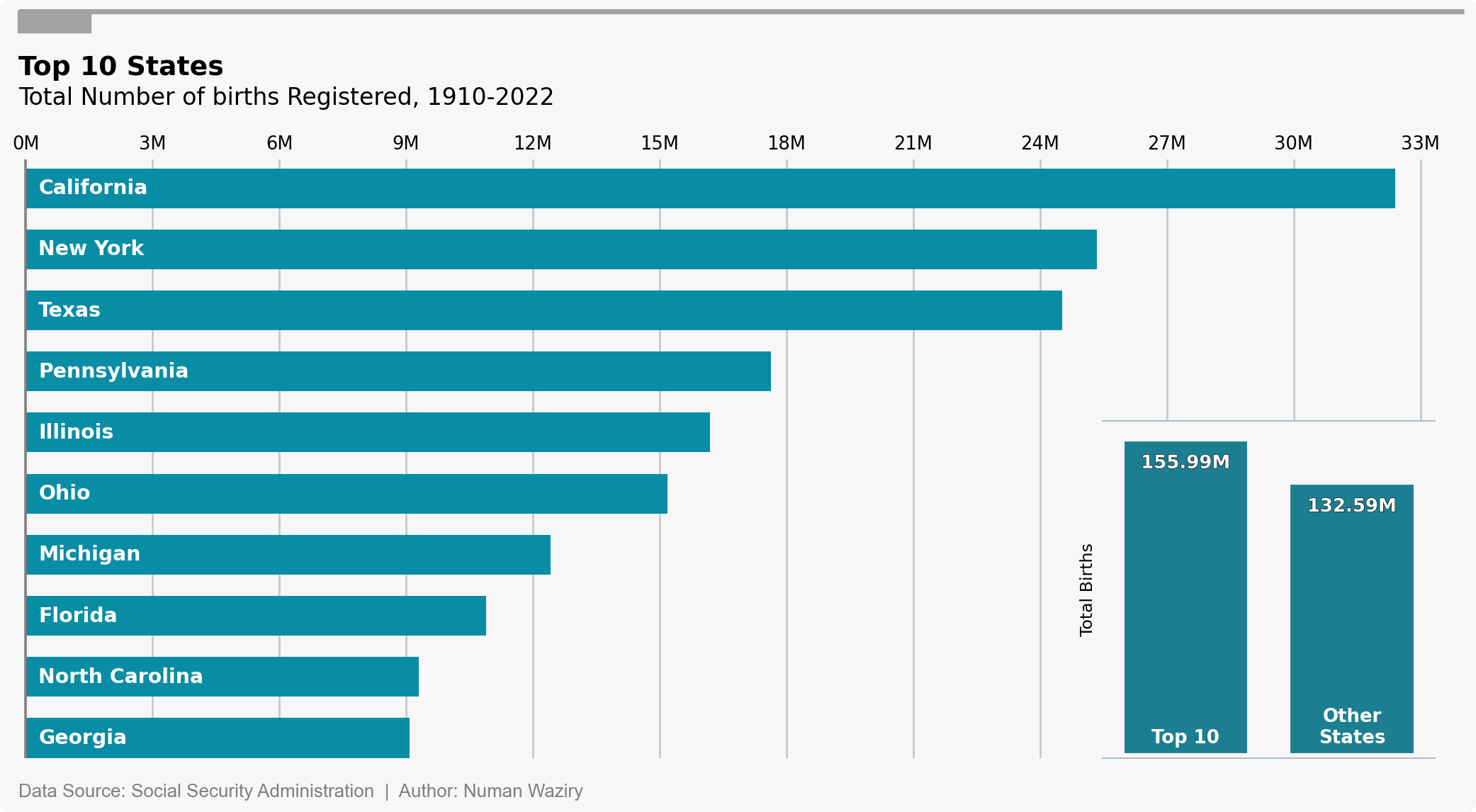 figure 7
Names
In the second section of our exploratory data analysis (EDA), the focus shifts to names, which arguably play a crucial role in shaping personal identities. This analysis delves into the intricate connections between names, births, and time, shedding light on noteworthy and famous names that have left a lasting impact.
Top 15 Names Over the Last Century Across Genders
The first visualization in this section is a diverging barplot that presents the top 15 names for each gender over the last century. A notable observation from this visualization is that the most popular male names are adopted and used more extensively than the top 15 female names. This suggests that on average, males tend to adopt and embrace the popular names of their time to a greater extent than females.
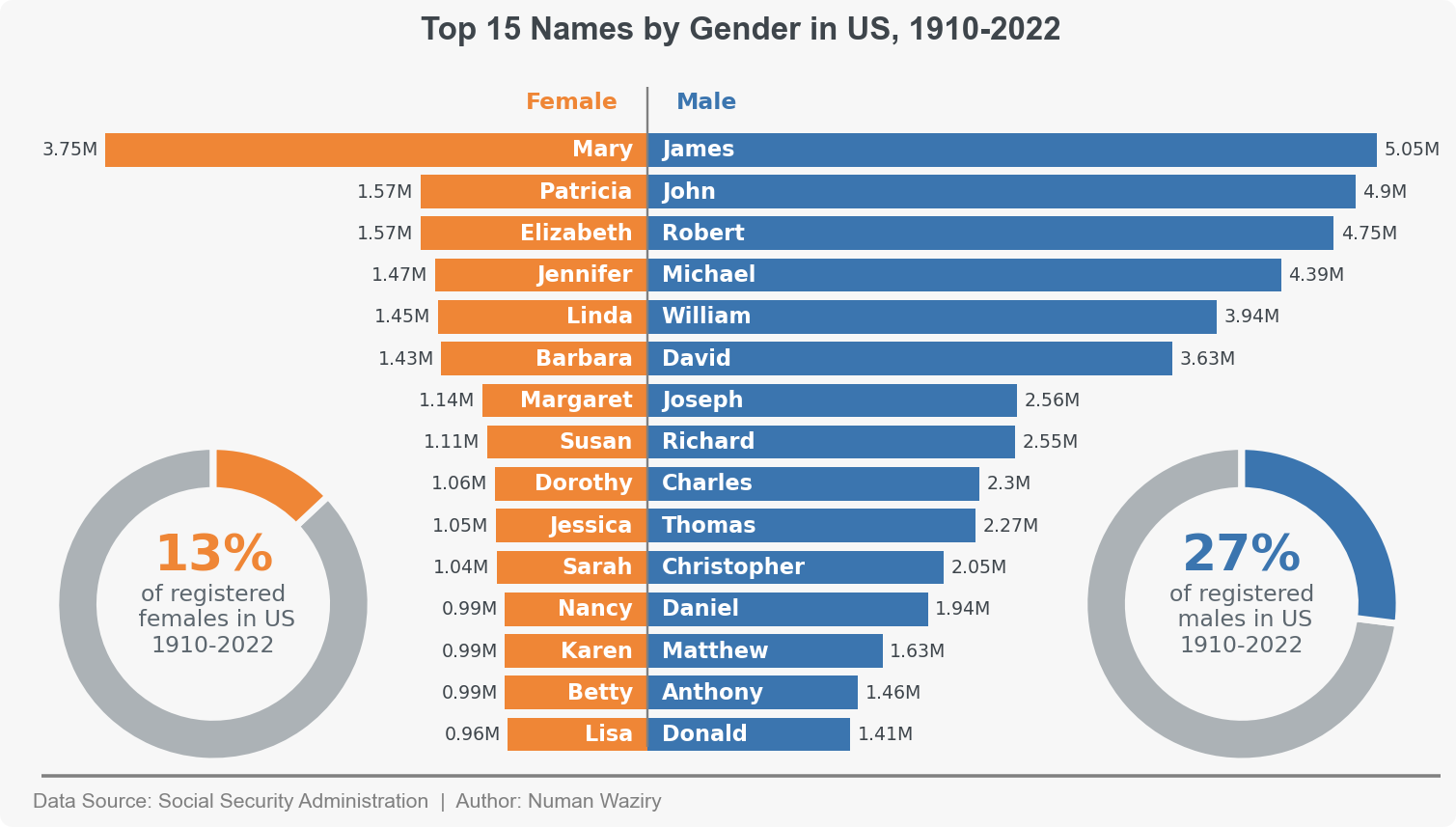 figure 8
Top 5 Names Every 3 Decade Across Genders
To break down the previous plot further, this visualization is structured into rows representing the combined top 5 names every three decades. By examining this barplot, we can quickly observe an interesting trend: the difference in the adoption of top 5 names between females and males appears to decrease over time. This suggests a potential shift towards more balanced name choices across genders.
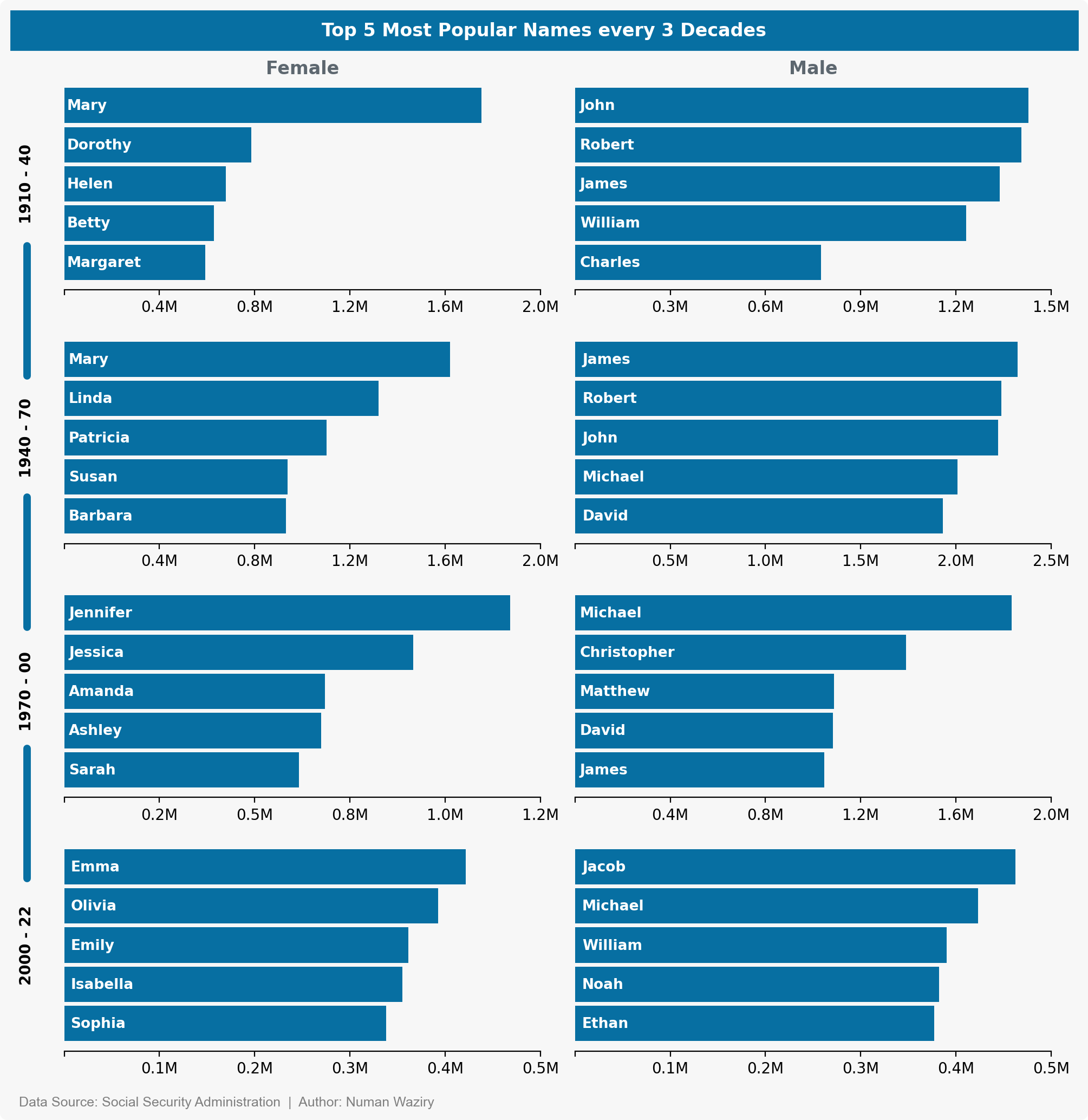 figure 9
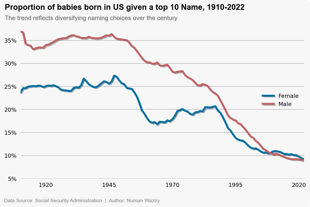
Proportion of Top 10 Names Over the Years
To quantitatively measure the discrepancy in name adoption between genders, a line plot representing the proportion of top 10 names contributing to total names each year is used. This visualization depicts two lines, one representing the proportion of males and the other representing the proportion of females using the top 10 names each year. And the temporal convergence between the two lines is clearly visible.
to better visualize the difference in proportions (of top 10 names usage) between males and females over the years, the overall trend can be excluded to show proportion of male top 10 names relative to females (male - Female):
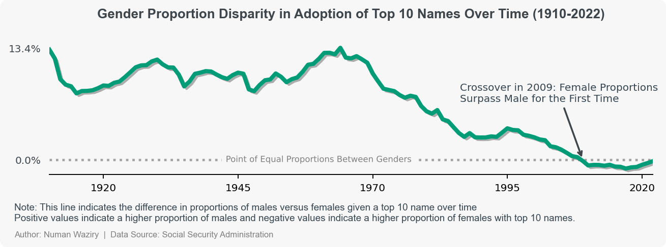 figure 11
Number of Unique Baby Names Each Year
The line plot represents the number of unique baby names over the years. The plot indicates an increasing trend in the number of unique names, suggesting a growing diversity in the names given to newborns. However, it is important to consider that this upward trend might be influenced by an overall increase in the number of births during the same period.
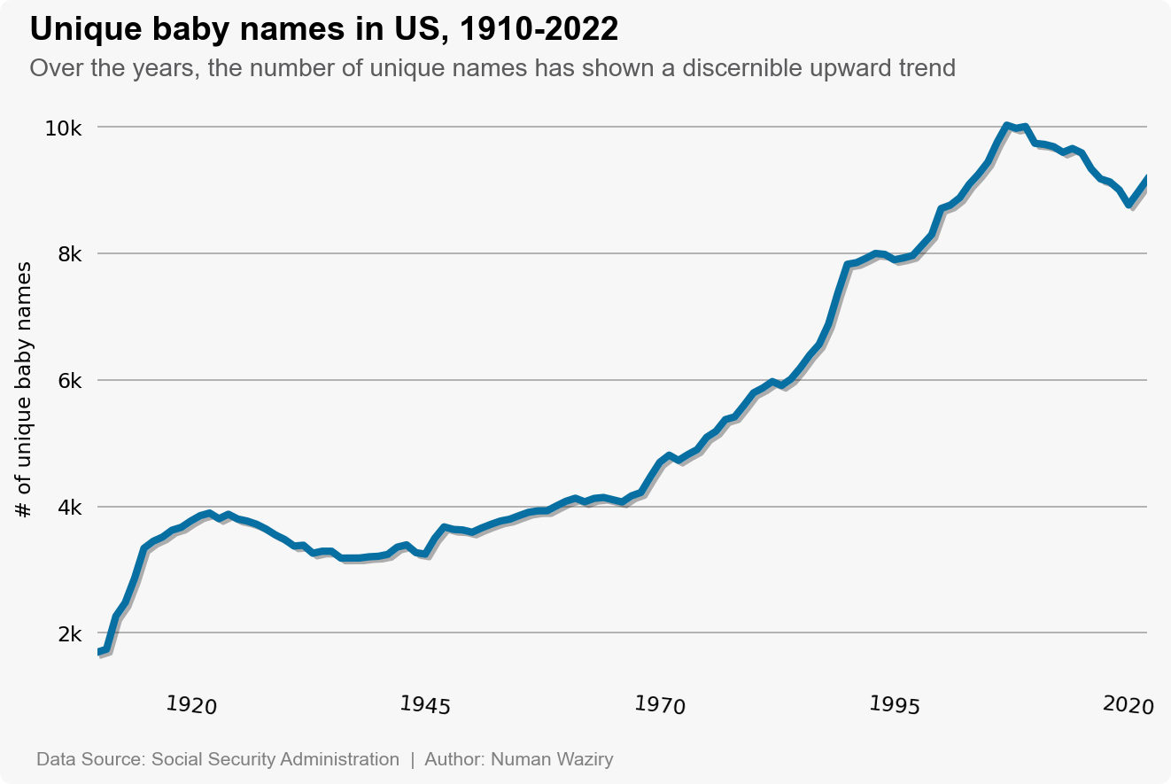 figure 12
Proportion of Unique Baby Names Each Year
As hinted in the previous plot, it is crucial to consider that the increase in unique baby names might be influenced by a rise in overall birth rates. This line plot reveals a compelling insight into the relationship between birth rates and unique baby names. As the number of births increases, the plot indicates a diminishing proportion of unique names. This trend suggests that with a growing population, the pool of available names becomes increasingly saturated, resulting in fewer remaining truly unique options. This concise interpretation highlights the notion that the abundance of names leads to a decrease in their relative uniqueness with respect to the number of births.
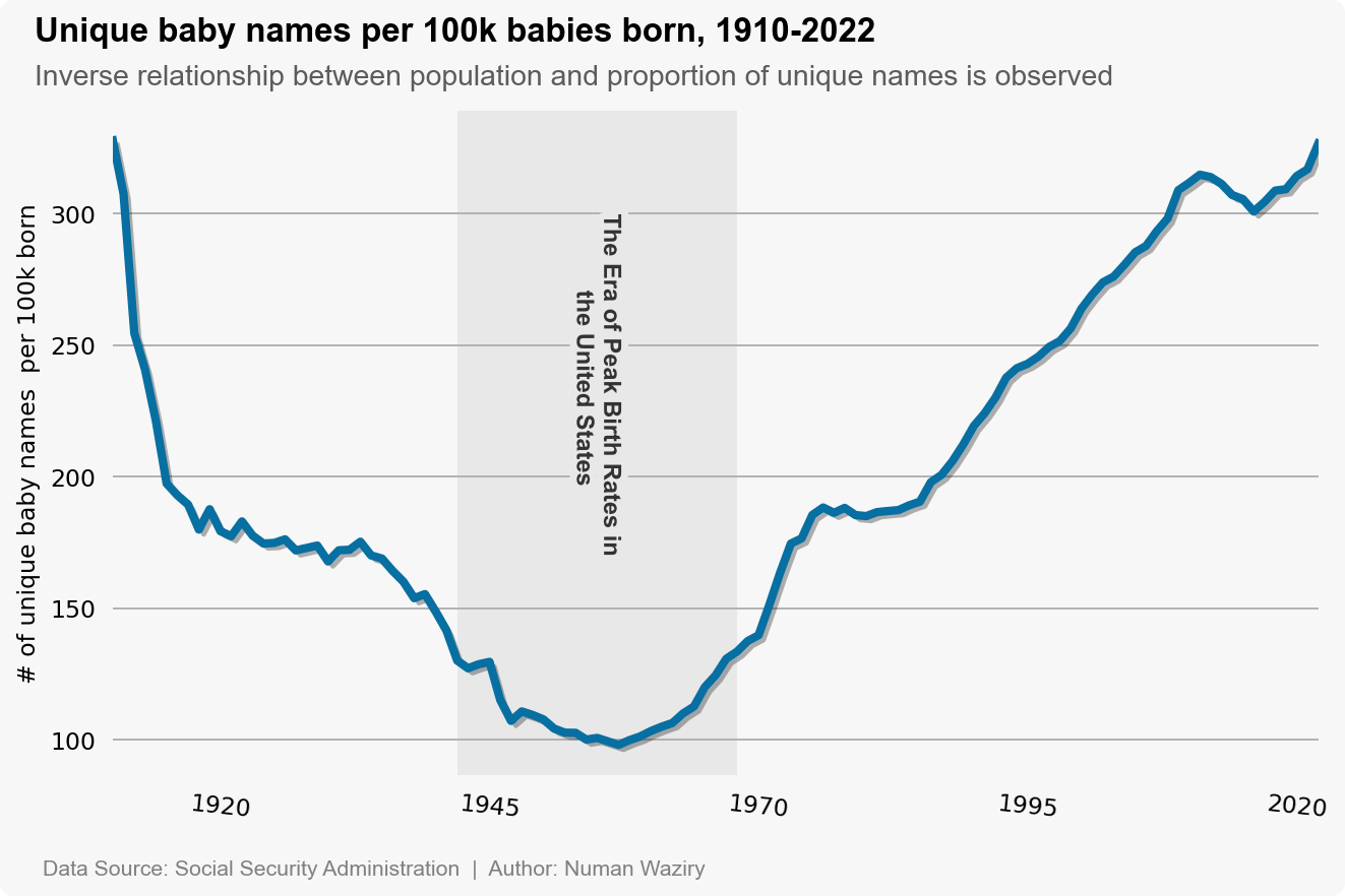 figure 13